I decided to start “Time Zoned” after I was doing my first Twitter Space and realizing again how complicated different time zones are.
I had some ideas in my mind about how to tackle the problem in a good way. This article just roughly pictures the solution that I want to come up with.
Some basic ideas of what makes the “Time Zoned” different, from solutions I know:
I had some basic thoughts but soon started talking to other people about it. This helped me a lot to verify them and to get more confident that I really wanted to realize it. I remembered Toms Scott’s videos about internationalisation and time zones as well. Also, I did some research about libraries for .NET. Turns out, for what I would like to do, I could combine things.
The List
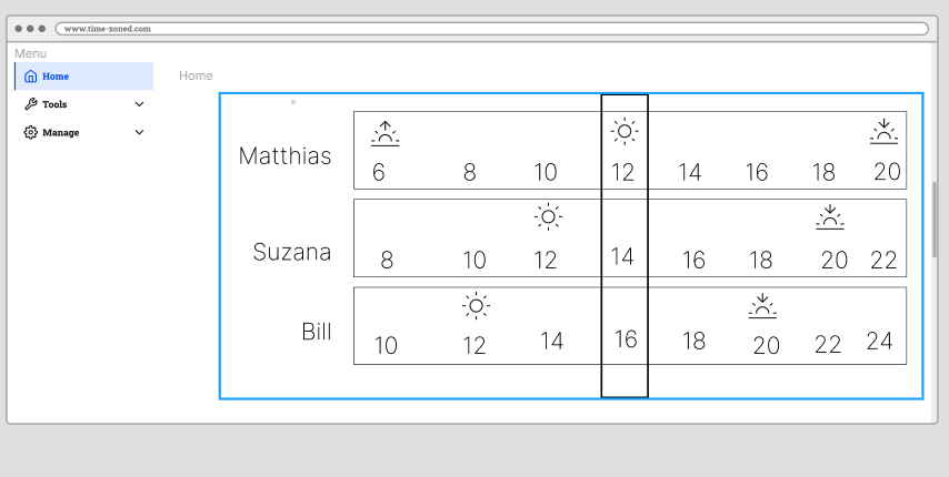
- Time rectangles showing the times of you (0…24)
- Time rectangles showing the times of your friends (friends have no special meaning in “Time Zoned”, could be any location you define)
- Nice Icons of the sun and moon indicated day and night. Combined with some nice colour schemes.
- Later: A way to import locations and your friend’s name. Especially from Twitter. But this is actually second priority, as many people have random locations in their social profile.
- Invitation only (Beta)
- Free of charge
First UI Sketch
This is just a first try with Figma. I do not know the tool well yet. However, it looks a lot better than my hand-drawn idea and is also more appropriate to really have a clear idea of the UI.
Imagine the different rectangles as time scales. They are aligned so that you can easily read the time. Some indicator (here a rectangle) shows the current time. Furthermore, imagine some gradients indicating day and night by colour as the background of the “time rectangles”.
You are welcome to contact me in case you have something to add or contribute in general!
I saw similar UIs in the wild (I think it was for meeting arrangement). However, this project is about putting together the pieces and learning.
Figma UI Sketch:


